The Third Colour: Finding a Bag Shade That Earns Its Keep in Britain
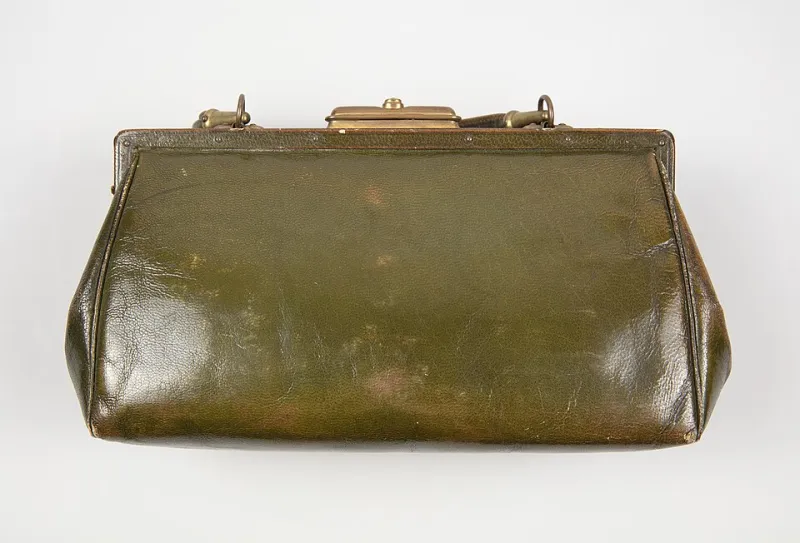
Photo: Unknown, No restrictions, via Wikimedia Commons
Black is easy. Tan is friendly. Neither asks much of you in the shop, which is exactly why so many of us default to them. But a bag is not a pair of socks. You will carry it through grey mornings, wet pavements, packed trains and the sort of winter coat that makes half your wardrobe look suddenly wrong. Colour is not the last decision before the till. It is part of whether the thing actually gets used.
Start with the light, not the lookbook
British daylight is not a single thing. A bag that looks rich and chocolatey under warm shop lighting can turn flat and slightly green by a north-facing window. A pale stone colour that seems fresh in April can look like a smudge against a January sky. Before you fall for a shade, take it to the door or the window. Hold it at arm's length, then at your side. If the shop has a mirror near daylight, use it. If not, your phone camera in natural light is a decent second opinion — just remember it will flatter more than your actual hallway does.
This is not about finding a colour that looks good in every light. Nothing does. It is about knowing where the bag will spend most of its life. If it lives under a desk and comes out at 6pm, it needs to work in office lighting and pub lighting. If it is a weekend bag, it needs to survive the flat white glare of a supermarket car park and the murk of a Saturday afternoon in November.
The coat is the real backdrop
Most bags are judged against outerwear, not against the outfit underneath. From October to March, that means a lot of navy, charcoal, olive, camel and the occasional burgundy. A dark brown bag against a navy coat can look muddy unless the brown has enough warmth or contrast. A black bag against a black coat can disappear entirely — fine if that is the aim, less fine if you want to find it in a pile of coats at a friend's house.
Olive is a quietly useful third colour. It sits well with navy, grey and denim, and it does not shout. Deep green, oxblood and slate blue do similar work. A mid-grey bag is a good compromise if black feels severe and tan feels too seasonal. Cream and ecru look excellent in theory, but they are a commitment in a country that specialises in wet bench slats and muddy bus floors.
The test is simple: wear the coat you actually wear most. Not the one you wish you wore. Hold the bag against it in daylight. If the two colours make each other look tired, believe that. You will not fix it with a scarf.
Denim has a long memory
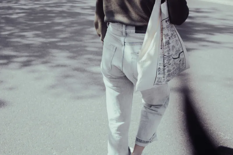
Indigo transfer is the quiet enemy of lighter bags. Raw denim is the obvious offender, but even well-washed jeans can leave a blue-grey bloom on pale canvas, suede and untreated leather. It tends to appear exactly where the bag rubs against your hip or where a shoulder strap sits against a shirt. On dark bags, it is invisible. On cream bags, it becomes a map of your commute.
If you want a light bag, choose a material with a tight, forgiving surface and accept that it will change. Waxed cotton can be cleaned and re-waxed. Coated nylon wipes down. Suede is lovely and deeply impractical in a wet climate unless you enjoy the look of a bag that has been through something. Pale leather can be treated, but it will still show the rub. None of this is a reason to avoid a colour. It is a reason to choose it with your eyes open.
Corners tell the truth
Scuffed corners are where a bag's colour really earns its keep. Black leather shows grey scuffs and edge wear quite clearly, especially on the corners and the base. Tan and light brown show dark marks and water stains. Dark brown, olive and deep green hide a surprising amount. Smooth leather shows every knock; grained leather and waxed cotton are more forgiving.
Look at the corners of a display bag if the shop has one. Look at the base. If the bag is already showing wear on the shop floor, ask yourself whether that wear looks like character or damage. A dark olive canvas with a bit of grit on it looks like it has been somewhere. A pale suede bag with a grey corner looks like it has been somewhere it should not have been.
Hardware matters too. Brass tones warm up brown, green and navy. Silver and gunmetal look cleaner against black, grey and blue. But hardware also scratches. A bright polished buckle on a dark bag will show every knock; a brushed finish hides more. If you are the sort of person who drops a bag on the floor without thinking, let the hardware be duller than your ambitions.
A five-minute test before you commit
Take the bag to the window. Hold it against your coat. Then hold it against a plain white shirt or a grey jumper — the sort of thing you actually wear on a normal Tuesday. If it looks good against both, you are close.
Next, check the wear points. Run your thumb along the bottom corners and the base. Look at the zip tape and the strap edges. These are the places where colour goes first. If the material looks thin or the finish looks painted on, a darker shade will not save it.
Finally, ask one blunt question: if this bag were the only one I owned for a year, would I still like the colour in February? Not in a shop, not on a screen, but on a wet Thursday when you are late and the light is awful. If the answer is yes, it has earned its place. If the answer is a shrug, put it back. The third colour is not the brave choice. It is the one you will still reach for when black and tan feel like a uniform.